Why Small Businesses Need a Mobile Responsive Website
It's no secret that most individuals now regularly use their smart phones as much, if not more than their laptops or PCs. This is particularly true for young people who often don't even bother to buy a traditional computer anymore but instead rely on their smartphone and perhaps a tablet device. According to SimilarWeb's State of Mobile Web US 2015 report, it is estimated that over 55% of users are accessing the internet via mobile devices. Each website of course is slightly different in its percentage of mobile users, but the trend is the same. The number of users are browsing the web from the convenience of their mobile device is on a continued rise.
It should come as no surprise, then, that small businesses should create a mobile or “responsive” website if they have not already done so. Besides the fact their users will most likely appreciate a website that it optimized for mobile devices, as of early 2015, responsive websites are a ranking factor when it comes to search engine optimization (SEO).
What is a responsive website?
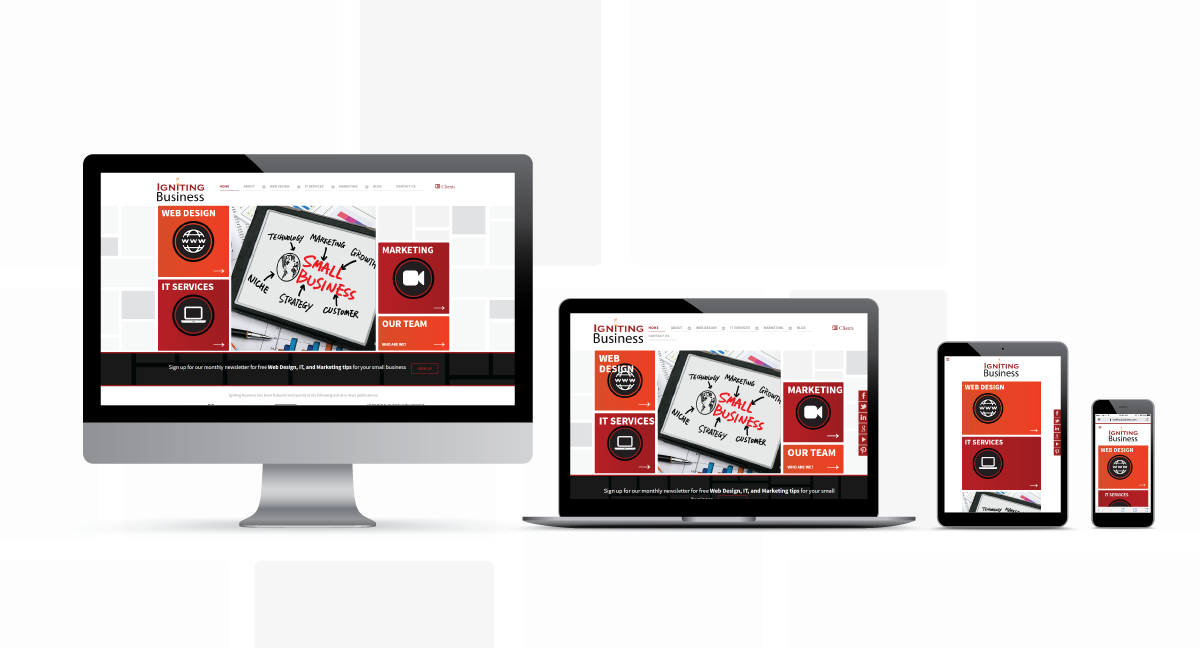
A responsive website is one that is built in such a way that it automatically responds to the varying sizes of devices including tablets, phones and desktop computers. The website’s design appropriately sizes its content to look good on any size screen. Also, the website’s menus, buttons and content is also optimized for “touch” devices. A responsive website eliminates the need for one website for your desktop users and another separate site for your mobile users. A responsive website can appropriately size its contents based upon the user's needs. You can test an individual webpage for mobile-friendliness using Google’s test here.
What are the SEO benefits of a responsive website?
Google wants to provide its mobile users with the best experience possible. Beginning in 2015, Google now places a higher ranking on those sites which are already optimized for mobile devices. This is especially true for local SEO strategies. In addition, in 2016, Google released a new framework known as AMP, or Accelerated Mobile Pages, designed to further enhance and differentiate mobile websites. Read about AMP in one of our recent blog posts.
If you want to talk more about designing a website for your company to accommodate more than just desktop computers, please contact us. We can help your business keep pace with SEO trends in order to remain competitive on the World Wide Web.
