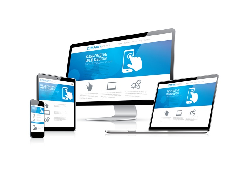
5 Best Practices for Responsive Web Design
Since 2015, Google and other search engines have continually placed more emphasis on mobile-friendly websites and today, mobile-friendliness is a direct ranking factor for displaying in search results. In order to improve your search engine rankings, boost traffic, and deliver a better user experience for your current and potential customers, it is crucial to ensure your small business website is optimized for mobile devices. Check out these five best practices for responsive website design.
1. Device Adaptability
Responsive breakpoints should be added to your small business website in order for your website to adapt to different devices and layouts. A breakpoint is a point at which the website design and content adjust to adapt to different screen sizes and provide the best possible user experience. It’s not only important to consider what devices may be used to view your website, but also how users will view your website, (i.e. downsized desktop browsers, mobile landscape mode, etc.).
Keep in mind that even if your website template framework has breakpoints automatically added, you should still verify that the breakpoints are logical for your design and content.
2. Clean and Properly Sized Typography
When creating a responsive web site, it is important to ensure your website visitors can easily read your site content on all devices. If mobile users have to squint or zoom in to read through your website, it’s not likely they will stick around. Conversely, if large headlines look great on desktops, but they are far too large for a mobile screen causing odd line breaks and excessive scrolling, this can cause frustration as well. Balancing the headings and font sizes across multiple devices will help provide your website visitors with an optimal reading experience.
3. Easy-to-Find CTAs
The goal of most websites is to drive visitors to complete a specific goal or a call-to-action. Your call-to-action (CTA) should be clear and easy to find across all devices, and CTA buttons or forms made easily accessible. CTA buttons may be clickable on desktops, but fingers lack the sharp precision of a mouse. Additionally, mobile users are likely to skim content and scroll quickly to find their desired action. Therefore, your CTA text or button should be made large and hard to miss for mobile users.
4. Simpler Navigation
Your small business website navigation should adapt to multiple device layouts for a better user experience. Navigation that works well on desktops may not be feasible for mobile devices, and confusing navigation can quickly turn away website visitors. To ensure great user experience, it is essential to keep your links clear and the navigation menu simple across all devices.
5. Design for Thumbs
Device interaction is another important factor to consider when designing your responsive website. On mobile devices, users can reach the device's center more conveniently than the top or edges. Therefore, interactive features should be at the center of the screen, and navigation functions should be made blatantly obvious and easily accessible for mobile users.
Contact Our Responsive Web Design Professionals
At Igniting Business, we design affordable, effective, and responsive websites to help small businesses succeed. For more information regarding our web design services, please don’t hesitate to contact us today!
