Static vs. Sticky vs. Sticky-on-Scroll-Up Navigation: Which One Should Your Website Use?
As a result of designing websites for more than 20 years, I’ve watched navigation features evolve alongside both technological advancements and consumer behavior shifts. Navigation design matters more than most business owners realize.
Your navigation (or menu bar) is one of the most frequently used parts of your website, but it also competes with the content for limited screen space.
The right navigation behavior can make your site feel effortless to traverse. The wrong one can quietly chip away at engagement because it feels hard-to-use, takes up too much room, or feels like an afterthought.
In this article, I’ll break down the three most common options for navigation bar design:
- Static navigation
- Sticky navigation
- Sticky on scroll up
I’ll also share what we recommend for desktop vs. mobile, and a simple decision matrix you can use quickly.
Table of Contents
- Why Navigation Design Matters: Attention, Screen Space, and How People Scroll
- Types of Navigation Bars
- Desktop vs. Mobile Nav: They Don’t Have to Match
- Summarized Evolution of Navigation
- Not Sure Which Navigation Is Best for Your Audience?
Why Navigation Design Matters: Attention, Screen Space, and How People Scroll
People scroll more than they used to, but users don’t treat every part of the page equally.
Nielsen Norman Group’s eye-tracking research describes the tradeoff between content and interface elements as the content-to-chrome ratio — every pixel of navigation, headers, and UI (“chrome”) reduces visible content space. So, the real goal isn’t “make nav always visible.”
Instead, the goal should be to make navigation accessible when users need it — without constantly getting in the way.
Types of Navigation Bars
The following covers three options with the goal of maximizing your visitor’s user experience.
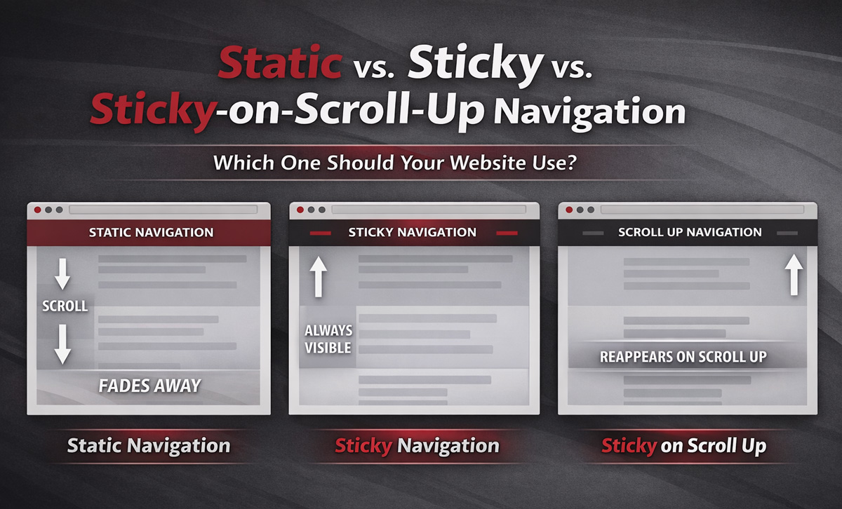
Static Navigation
What Is Static Navigation?
A static navigation bar sits at the top of the page in a traditional web page layout.
The static navigation bar is visible when someone first lands on the page. However, as a user scrolls down, the nav bar disappears with the rest of the content.
This was the standard behavior for most of the early web.
Why Static Used to Be the Only Option
For years, static navigation was simply how websites worked. It was predictable, universally supported, and aligned with how early sites were built. If you were in the middle of a page and you wanted to get back to the website navigation, you’d simply scroll to the top of the page.
But user behavior has changed.
People scroll more. They skim. They jump between sections. They make navigation decisions mid-page.
Static navigation doesn’t adapt to that behavior.
Why Static Navigation Is Often the Weakest Option Today
Static navigation still works, but it tends to introduce friction:
- Users must scroll back to the top to navigate.
- It interrupts momentum. If someone decides mid-page to explore another service, click the Contact Us or phone number on your nav bar, etc. they have to stop and scroll back to the top of the page.
- It underperforms on mobile. On a phone, scrolling back to the top is a bigger interruption than on desktop due to responsive content sizing.
Static navigation isn’t necessarily “wrong.” It’s just rarely optimal in modern browsing environments.
Sticky Navigation
What Is Sticky Navigation?
A sticky navigation bar remains visible at the top of the screen as users scroll down.
In essence the navbar is always visible (or “sticky”) and follows the visitor throughout the page.
A more technical name for this type of nav bar is known as a persistent header, and Nielson Norman Group notes that it reduces friction by keeping navigation controls available at all times.
Why Sticky Navigation Works
Sticky navigation solves a lot of issues for visitors. Namely, sticky navigation:
- Reduces effort when moving between pages
- Improves discoverability of menu options
- Supports recognition over recall (users don’t have to remember where navigation lives)
- Promote cross-selling/awareness of other services/products and key pages.
When visitors are frequently navigating between pages, sticky can be extremely helpful.
When Sticky Nav Is Best (Desktop Recommendation #1)
On desktop, we typically recommend sticky navigation when:
- Your site is large and users are likely to explore multiple pages on a single visit
- You want visitors comparing services, industries, or locations
- You have important header actions (search, login, contact, schedule)
Sticky reduces friction and increases convenience in browsing-heavy environments.
The Biggest Challenge with Sticky Nav
A sticky navigation always takes up a portion of the screen. As a result, you are giving up part of the screen (content space) for the sake of the sticky nav. As such, you must:
- Make sure the sticky nav bar is not too large vertically.
- Ensure that the sticky nav is truly necessary; otherwise, consider using sticky on scroll up.
If your sticky header dominates the screen, it starts competing with your content. Keep it lean.
Sticky on Scroll Up Navigation (Recommended for Most Cases)
What Is Sticky on Scroll Up Navigation?
Sticky-on-scroll-up navigation hides the navigation bar when the user scrolls down or is focused on reading a section and reappears when they scroll up.
Another name for sticky on scroll up is a partially persistent header.
This type of nav bar attempts to interpret user intent:
- Scrolling down = “I’m consuming content” and thus don’t need a nav bar in the way.
- Scrolling up = “I may need navigation” and thus triggers the nav bar to reappear.
Why Sticky on Scroll Up Is Often the Best of Both Worlds
Sticky-on-scroll-up is our favorite type of nav bar due to its versability and balancing user navigation with optimal content visibility.
Using a sticky on scroll up nav bar:
- Maximizes content visibility
- Reduces constant visual competition
- Keeps navigation accessible when users signal they need it
Given mobile devices have even less visual real estate, sticky on scroll up is especially effective on mobile devices.
Desktop vs. Mobile Nav: They Don’t Have to Match
One of the biggest missed opportunities in modern web design is assuming navigation behavior must be identical across devices.
It shouldn’t. Treating your mobile and desktop users the exact same way is a missed opportunity.
Our Default Desktop Navigation (Standard Recommendation)
On desktop we recommend that you:
- Use Sticky if visitors frequently access navigation and move between many pages during a single visit.
- Use Sticky on Scroll Up if you want to maximize content visibility and your pages are longer or more educational.
Our Mobile Recommendation (Almost Always)
On mobile, screen space is significantly limited.
Persistent headers consume proportionally more vertical space on mobile devices, making the content-to-nav tradeoff more significant.
For that reason, our default mobile recommendation is almost always Sticky on Scroll Up.
Sticky on scroll up mobile nav preserves content space while keeping navigation easily accessible when users signal intent.
The main exception is application-style experiences (dashboards, portals, tools) which may require a sticky nav.
Navigation Type Decision Matrix
Summarized Evolution of Navigation
Here’s how navigation patterns have evolved:
- Static was the original default.
- Sticky reduced navigation friction.
- Sticky on Scroll Up refined the experience by aligning with scroll behavior psychology.
Each step reflects a better understanding of how users consume content.
Modern navigation isn’t about making menus constantly visible. It’s about reducing friction while respecting attention and screen space.
Not Sure Which Navigation Is Best for Your Audience?
If you’re debating between sticky and sticky on scroll-up, that’s a good sign you’re thinking about your site strategically.
Consider reviewing:
- Your page types
- Your typical user journeys
- Your mobile vs. desktop behavior
- How navigation supports (or interrupts) your goals
Pro Tip: use a conversion rate optimization tool like Hotjar or Zoho PageSense to watch actual customer journeys, conduct user surveys, and even track scroll behavior.
If you’re still not sure which type to use, feel free to contact us for more information. If you want more tips like these, subscribe to our free monthly newsletter which is packed full of web, marketing, SEO, and business tech tips!
At no additional cost to you, we may receive a commission if you click on some of the links on this website and make a purchase.
