Best Web Design Trends in 2026 Ranked
At no additional cost to you, we may receive a commission if you click on some of the links on this website and make a purchase.
As a web designer who has been building websites for over 20 years (yes, I realize that may make me old in tech-years), I’ve seen a plethora of web design trends come, go, and even some be recycled and re-used nearly a decade later. I’ve put this article together to showcase the best and common web design trends of 2026. Our article’s trend list is based upon a combination of the following:
- Website designs and features that my team has encountered and researched.
- Requests from our clients and potential clients about various different web design elements.
- Research into other top web designers’ best practices.
- Examining award-winning website designs.
Keep in mind, just because something is a trend, does not mean you should implement it on your website. As such, I’ve also tried to include perspective for each trend and rank it to help you determine whether or not it’s a web design trend you should consider implementing and what pitfalls may occur if you implement.
Table of Contents
- Web Design Trend Ranking System Explained
- 2026 Web Design Trends
- AI Powered Chatbots
- Minimizing Margins and Expanding Max Width
- Engaging Interactive Elements
- Certification and Trust Badges (Widgets)
- Background Videos
- Splash Pages (Minimalist Home Pages)
- Asymmetric Layouts and Overlapping Visual Elements
- Diversifying Contact Methods
- Replacing All Images and Text with Videos
- Improve Page Speed
- Creative Scrolling Experiences (Scrollytelling)
- Optimization for Search Engines and LLM’s (AI)
- Dark Themed Websites or Dark Mode
- Stay Up-To-Date the Latest Web Design Trends
Web Design Trend Ranking System Explained
Not every web design trend may be a good one for your business. As such, it is critically important to weigh the pros and cons of any web design trend you are considering implementing. To help you along, I’ve created a simple 3-tier ranking system to help you understand the risk level of each trend:
🟢 Go for It – We highly recommend implementing this web design trend if possible as it will likely benefit your website with little to no side effects.
🟡 Proceed with Caution – This web design trend might work for your website, but it requires careful consideration regarding the possible negative outcomes or costs associated with implementation.
🔴 Stop Right There – This web design trend is likely not worth your time due to the cost, or it could be harmful if implemented poorly.
2026 Web Design Trends
The following are the top 2026 web design trends we have seen so far in 2026 and as 2025 wrapped up.
AI Powered Chatbots
🟡 Proceed with Caution
Having a chat system on your website is not a new concept. However, with the increasing presence of LLM’s (Large Language Model) and AI-powered tools, creating an AI-powered chatbot is becoming more accessible, affordable, and common in websites. For example, large software companies like Google and Microsoft are rolling out easy-to-configure AI powered chatbots for e-commerce stores and business websites.
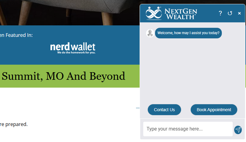
That said, it’s important that your chatbot be trained on the right data set and associated responses. If poorly implemented, an AI chatbot can actually lower your brand’s perceived quality. For example, if your chatbot frequently does not actually answer the questions your customer is asking, provides incorrect information, loads answers slowly, or is altogether unhelpful, this can hurt your reputation and lead to customers leaving out of frustration.
If you use an AI chatbot, be sure you've trained it well and test it on an ongoing basis!
Minimizing Margins and Expanding Max Width
🟡 Proceed with Caution
In the early days of web design, designers were building websites for traditionally relatively square monitors. Overtime, we shifted to a rectangle shaped monitor (typically with a 16:9 ratio). Yet websites' content was still typically set to not exceed a specific max width. Beyond that max width, you would see either a page background or an outside gutter (margin). Even the Igniting Business website that you're reading now has a built-in margin that appears larger on my 27" monitor vs. my 23" monitor.
However, as screen sizes and monitor resolutions continue to expand, especially horizontally, more clients and designers want to leverage the full width of these larger monitors. As a result, the default max width is increasing and margins are often reducing.
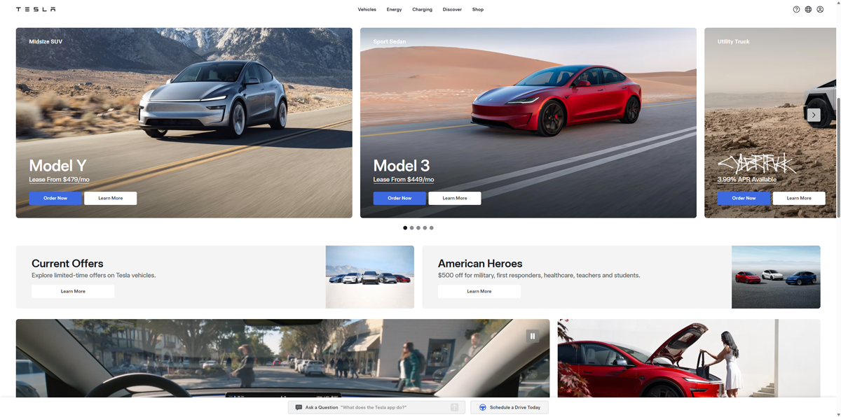 Example of website with minimal outside gutter (Tesla.com)
While leveraging the width of your visitor's entire screen can have some benefits, it's also important that it does not degrade the user experience. Expanding max width often requires higher resolution images that can dynamically scale, as well as double checking your content on even more screen sizes to avoid issues. Additionally, having no outside gutter can also lead to a bit of visual overwhelm if not crafted carefully.
Engaging Interactive Elements
🟢 Go for It
Websites don’t have to be static text, images, or even just videos. You can implement various interactive elements like comparison sliders, industry-specific calculators, counters, progress meters, flip cards, Lottie animations, and more. Your visitors’ use of these features can improve their experience and also signal search engines that customers are interacting with your content through increased dwell time.
 Example of interactive comparison (before and after) slider.
💡Pro Tip: To measure success, track engagement with your interactive elements using heatmaps and click tracking via Hotjar.
Certification and Trust Badges (Widgets)
🟡 Proceed with Caution
We are seeing an uptick in organizations issuing and pushing badges. For example, Google previously had a hard-to-earn Top Quality Store Badge that it has now turned into three different Google Store Widgets that essentially every e-commerce site can display at least one with a few relatively simple steps. Additionally, Google rolled out the "add as a preferred source on Google" badge for content publishers.
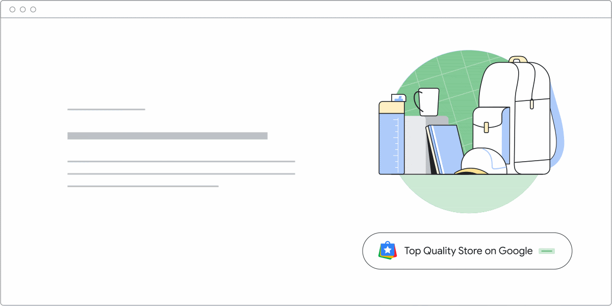 Example of the Top Quality Store Widget in Action - Image Courtesy of Google Search Central
Google isn't the only one pushing badges. Our web design and web maintenance teams are experiencing a measurable uptick in requests for adding additional certification badges and trust seals from numerous organizations including industry-specific certifications, accreditation services (like the Better Business Bureau), accepted payments badge, review us on X platform, guarantees/money-back policy badges, security seals, and more!
Yes, these badges can help instill trust with visitors. However, we caution you not to go overboard and make your sites cluttered and overwhelming. Instead, focus on the most important badges that would resonate best with your customers and add them to the most relevant places (which should likely vary based on service or product).
Background Videos
🟡 Proceed with Caution
As you’ve scrolled through websites, you’ve likely seen text content overlayed on background images. It’s becoming more common for background videos to be used instead of static images, giving a sense of movement and intrigue to the content.
This can be a powerful visual tool. However, you must be careful with videos since they increase the load time of the page dramatically. Thus, it is important to use this sparingly, or at very least implement an image fallback for devices with lower connection speeds.
💡Pro Tip: Use an SEO tool like Semrush to monitor the page speed performance, SEO, and accessibility impact of any pages that you integrate video.
Splash Pages (Minimalist Home Pages)
🔴 Stop Right There
You may have noticed that when you click to some websites home page, they show an extremely simplified, single “splash page” with very introductory/welcome content or a special offer. This might be paired with a catchy graphic or video but very minimal text. After you’ve read this introductory content, you must click a button that says “enter site” or “continue” to get to the true home page.
These pages are horrible for your online presence. First, they can create confusion and frustration for users that just want to get to the meat of what you do. However, more critically they are extremely harmful for search engine rankings. The “main” page, or home page, is one of the most important pages of your website for SEO. By limiting yourself to a minimalistic splash page, you actually hurt your presence within search engines.
💡 Pro Tip: If you’re thinking about making drastic changes to your home page, you should implement a rank tracking system to see how it performs in search engines both before and after your changes. Additionally, you could use a conversion rate optimization tool, like Hotjar, to track how users interact with the old and new page.
Asymmetric Layouts and Overlapping Visual Elements
🟡 Proceed with Caution
Asymmetric layouts are becoming extremely popular. Asymmetric layouts include sections and content that break out of the traditional “grid style” of websites. Not everything has to be perfectly balanced within a symmetric layout. Visual elements can cleverly overlap, increasing visual interest.
However, you must be cautious with asymmetric layouts and overlapping visual elements. They are much more difficult to create successfully. Additionally, these non-traditional design elements make it even more important to double-check your design on numerous devices and screen sizes. A specific asymmetric element may look perfect on a desktop layout but then be extremely frustrating or confusing on mobile devices.
 Click the image above to view an example of a website with asymmetric layouts.
💡 Pro Tip: In addition to testing your asymmetric layouts on multiple devices, consider using a CRO tool like Hotjar to complete screen recordings, heatmaps, and look for rage clicks from your customers.
Diversifying Contact Methods
🟢 Go for It
In the early years of web design, most people preferred to pick up the phone and talk to a person. Now, the percentage of people that prefer a phone call is declining. Your visitors will be split between preferences of phone calls, emails, form submissions, instant quotes, SMS/text messages, live chats with a human, or even interacting with speedy, always-available AI chatbots.
As such, it is important to offer multiple options to meet the needs and preferences of the majority of your audience. The one caveat is you must actively and attentively monitor all contact methods that you offer. Otherwise, you risk leads and sales slip through the cracks due to poor customer response times.
💡 Pro Tip: You can also use conversion tracking tool, WhatConverts, to see which contact methods are being used most frequently, as well as what marketing channels are creating the highest volume of quality leads.
Replacing All Images and Text with Videos
🔴 Stop Right There
Video content is more popular than ever. However, some web designers and marketers will push you to replace traditional text or images with videos instead, leading to videos seemingly everywhere on your website. Video production is not only costly, but loading those videos can dramatically slow down your website. Videos take significantly more bandwidth for both your web host, as well as your users’ devices and internet connections.
Additionally, video-only content will perform poorly in search engines.
Use videos only when they complement what you are trying to accomplish or can truly do a better job than traditional text and images. Keep in mind that not everyone will be in an environment where they can watch/listen to your video.
Improve Page Speed
🟢 Go for It
With Google’s Page Experience Update beginning official rollout in June 2021, it is important to have a fast-loading website. Google’s Page Experience Update includes Core Web Vitals which has a direct impact on search engine rankings.
With increased awareness and emphasis on a fast-loading website, some companies are choosing to emphasize speed instead of fancy features that might look good but negatively impact page speed.
💡 Pro Tip: Use an SEO and performance analysis tool like Semrush to measure the speed and other key SEO metrics of your pages.
Creative Scrolling Experiences (Scrollytelling)
🟡 Proceed with Caution
Scrolling is the most basic and common type of engagement users have with a page. In 2025 and 2026, scrolling experiences, or "scrollytelling," seem to be getting more involved than ever before as users encounter various imaginative experiences. Scrolling animations include items like triggered parallax effects, multi-layered imagery, and reveal-on-scroll elements. You’ll notice that many of these overlapping elements will change in position across the x or y-axis at different rates as you scroll up or down the page.
A word of caution with this feature is that some users may not want to go through the scroll experience if it slows down their access to critical information. Point being, weigh whether or not this feature would be useful for your audience or cause frustration.
💡 Pro Tip: If you’re not sure if your creative scrolling experiences are helping your visitors, consider using a CRO tool like Hotjar. You can view heatmaps to see how far users get in the scroll, as well as survey your customers to see how they are enjoying or hating the design experience.
Optimization for Search Engines and LLM’s (AI)
🟢 Go for It
Enterprise operations and small businesses alike are recognizing the importance of being found both within search engines and LLMs like ChatGPT, Gemini, Perplexity, and others. As these systems evolve, it’s important that your website is designed in a way that makes it easy for search engines and LLMs to read, understand, and ultimately recommend your website to its users.
Make sure you find a web design firm that also has an SEO services division or at least is able to work with a recommended third-party SEO company.
💡 Pro Tip: Track your search engine and LLM rankings with tools like Semrush or BrightLocal.
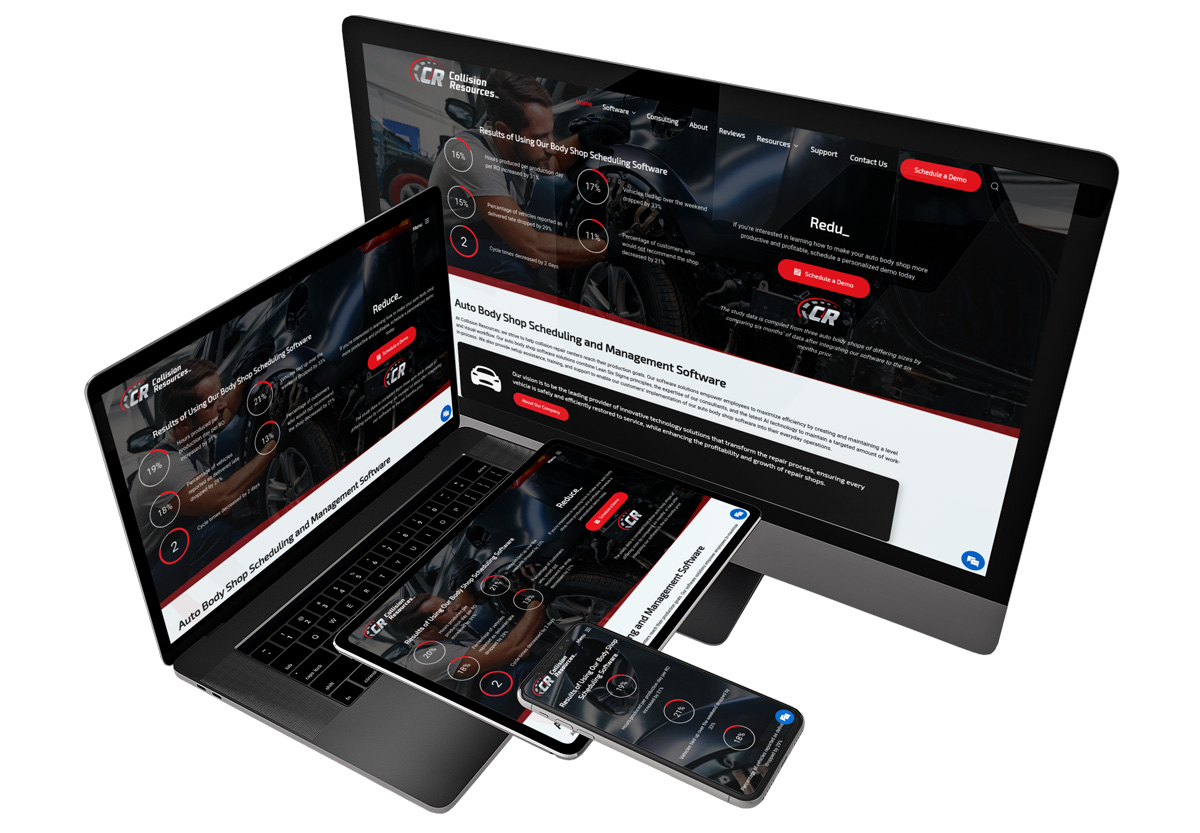
Dark Themed Websites or Dark Mode
🟡 Proceed with Caution
We’ve received more requests from clients than ever for dark themed website designs. This is a growing trend since dark websites reduce eyestrain and also help you stand out from the competition. Additionally, dark themed websites can improve visual content emphasis.
However, dark themed websites are more difficult to execute well. They require brand colors and images that don’t have white backgrounds and work well on dark backgrounds.
 Click on the image to view an example of a dark themed website.
💡 Pro Tip: If you are considering having web designer to create a dark themed website for your company, ask them to provide you a list of dark themed websites they’ve directly designed in the past. This should give you an idea of their design prowess with dark themed websites.
Stay Up-To-Date the Latest Web Design Trends
If you’d like to stay up-to-date on the latest web design trends, you should subscribe to our newsletter. We send out a monthly newsletter that’s packed full of web design, SEO, and marketing tips and trends. Best of all, it’s completely free.
At no additional cost to you, we may receive a commission if you click on some of the links on this website and make a purchase.
